(pastel? why didn’t they just call it “m”?)
My favorite technique for doing the “makeup” on a garage kit is pastel shading. This involves scraping soft pastels into a pigmented powder, then brushing said powder onto areas where you want to add a little color. It’s highly controlled and easily reversible, which is great when you’re like me and you’re never quite satisfied with the final result, and you end up wanting to strip everything off and redo it, ad infinitum… 😬
Here’s what you’ll need:
- Soft pastels
- Makeup brushes or other soft brushes
- Hobby knife
- Paper towel
- Kneaded eraser
A few notes before we begin: firstly, this technique should be done with soft pastels, NOT oil pastels. Soft pastels can be ground into a nice powder. Oil pastels can be ground into a nice mess. Secondly, the pastel powder will adhere best to a matte surface. I would recommend applying a matte varnish over whatever piece you’re working on. Thirdly, pastels can be hard to blend. I’d recommend getting a pack containing all the colors you think you’ll need rather than trying to mix your own colors. I use a 72-pack from Faber-Castell.

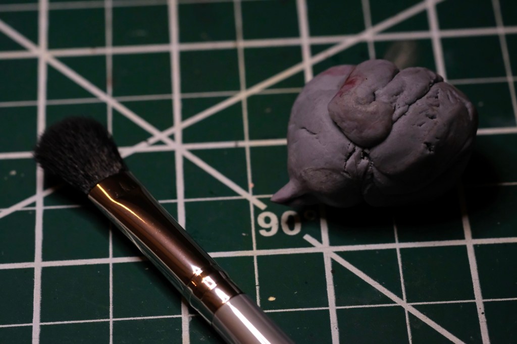
To start, simply scrape the pastel with the flat back of a hobby knife. Pigment should come off in a fine powder. I prefer to do this over a paper towel; this will catch the powder and prevent it from spreading. Do this for a few similar colors, not just the exact color you think you’ll need. What appears to be the perfect hue when viewed in isolation might look completely off when applied over another color! I find that I often need to use a darker color than expected.
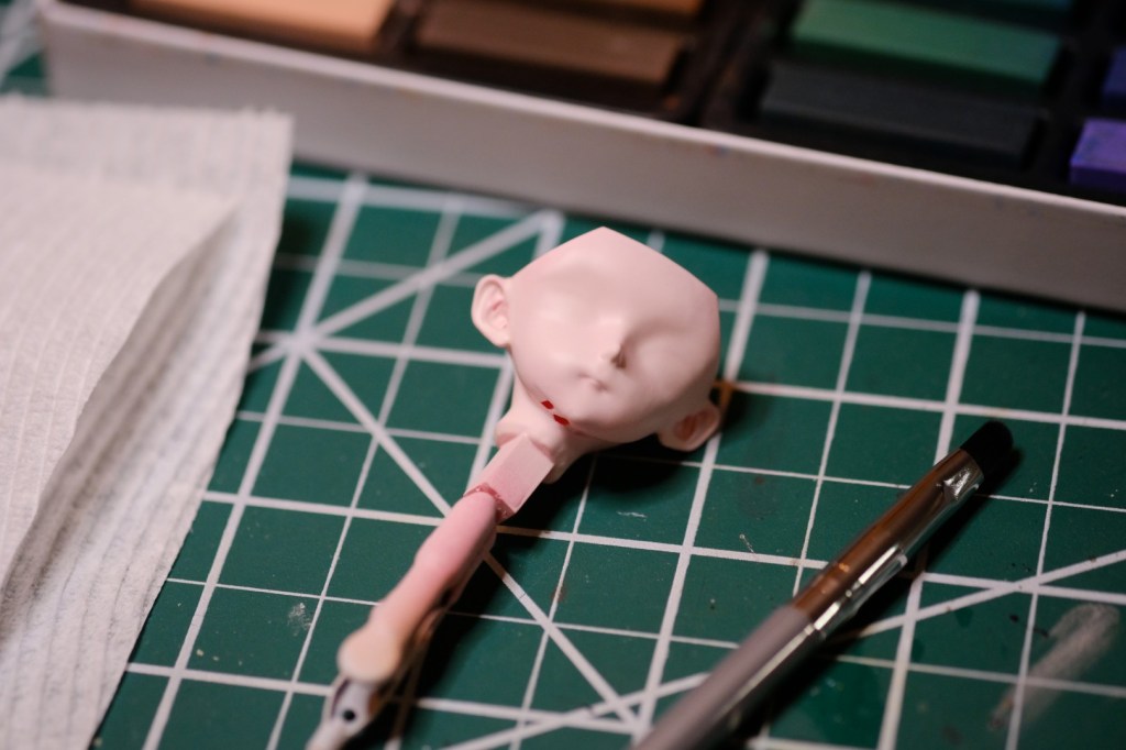
I recommend testing your color selections on a hidden area of the part you’re working on. In the photo below, I tested four different reds and pinks on the back of the head, which will be hidden by the hair. Don’t settle on your final color without testing it first!

The pastel powder can be applied using a brush. In this example I’m using a small precision makeup brush that I keep just for pastel shading, but you can also use a paintbrush; just make sure it’s completely clean and dry! Load up the bristles by dabbing the pile of powder a few times until you can see pigment accumulating in the brush tip. Now you can brush the powder onto your painted surface. As you do so, pay attention to the rate at which the color gains intensity. Add more pigment if you want the color to layer on fast and less pigment if you want more control. You can remove excess powder from the bristles by swiping them against a paper towel a few times.
As you apply the color, you’ll find that excess loose powder builds up on the surface of your piece. Brush this off regularly with a second, clean brush or blow it off with compressed air. It’s best not to let it sit there, since it will hide your work and mask the true color underneath.
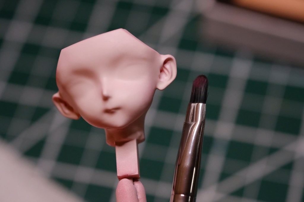
It’s easiest to start slowly and build the color up gradually, rather than trying to do it all in one pass. I tend to stay cautious and lean on the side of subtlety. It’s tempting to keep applying color until the shading becomes very obvious. This is a trap! Coloration that just appears obvious when you’re working often turns out to be way too much when you look at the final product. Every so often, hold the piece at a distance and try to take in the overall effect. Does the skin have a healthy glow to it? Is it too pale, or does it look like someone caked on way too much makeup? If that’s the effect you’re going for, then great; if not, it’s time to get back to work.
So what happens if you make a mistake and need to backtrack? Never fear! One of the advantages of pastel shading is that you can easily erase your work without fear of stripping the paint underneath. Just rub it off with a kneaded eraser. You can pinch a little corner of the eraser into a spike if you need to do some precision erasing.

When shading skin, I usually apply color to the joints, the tips of the fingers and toes, the palms of the hands and bottoms of the feet, and anywhere I want to add a little extra contouring. For the face, I add color to the lips, the cheeks, the nose, the tips of the ears, and a little under the chin. I use pastels somewhere on the spectrum of orange-red-pink, depending on the base skin tone. Use photo references or look at yourself in the mirror and pay attention to wherever there are variances in color, and don’t be afraid to use a little artistic license!
If you want more examples, check out custom doll builds on YouTube. Pastel shading is a popular technique in that community as well.
Of course, pastel shading isn’t just limited to skin. There’s a whole rainbow of colors available, and they give rise to any number of possibilities. I use this technique a lot to create shadows and subtle variations when painting clothing or other surfaces. Wherever you’re applying it, just make sure to test in a discreet area first!

Well, that concludes the tutorial. I had to keep reminding myself to take pictures since otherwise I just get sucked into the work. Then, before you know it, I’m done! With no pictures to show for it! And if I want to make a tutorial, I have to do it all over again! I avoided it this time, but it’s definitely going to happen at some point and I’ve accepted it as my fate. Anyways, thanks for reading! 🥰

Leave a comment